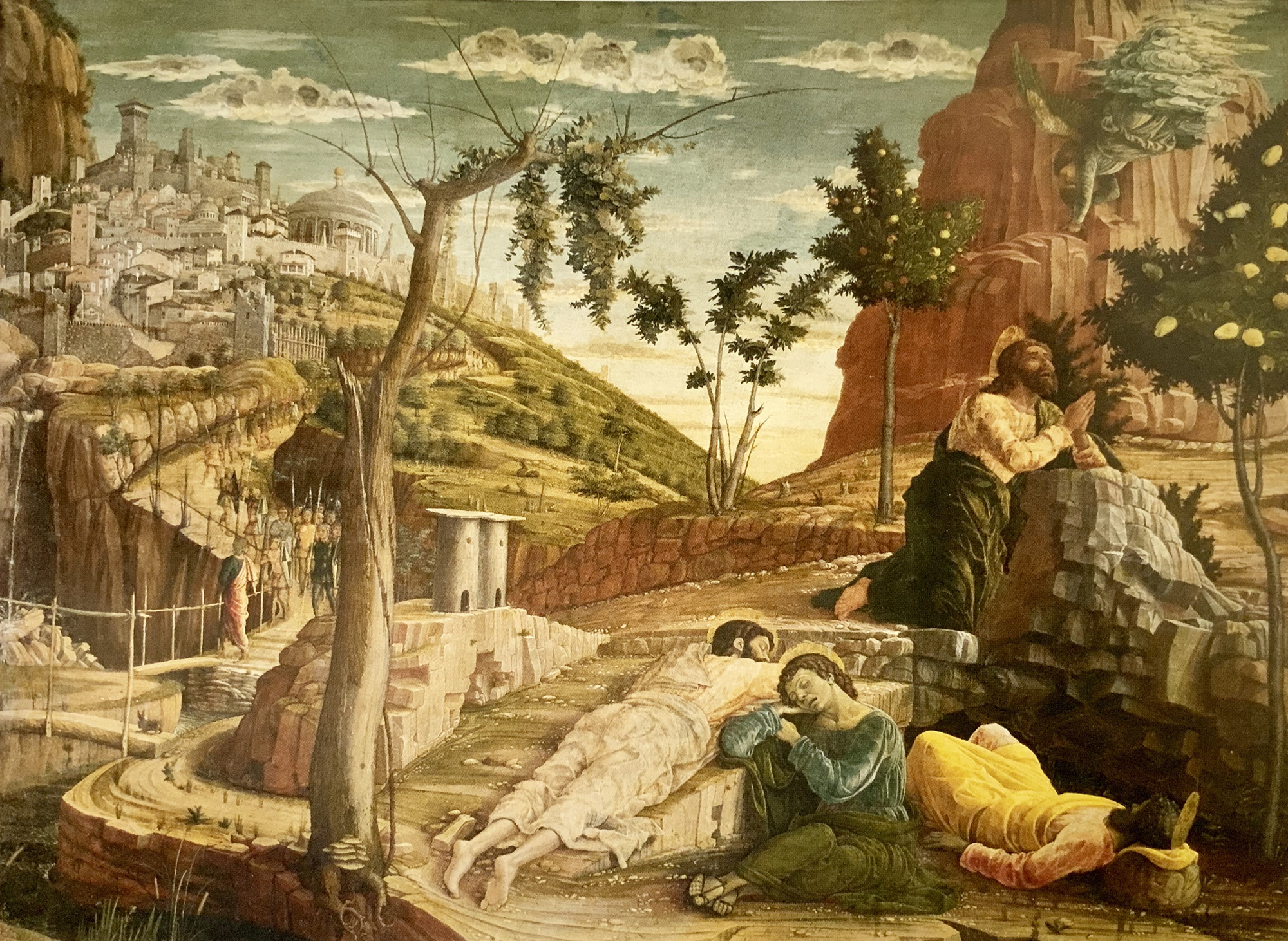
The Agony in the Garden (2nd), by Andrea Mantegna 1456-9
The Agony in the Garden (2nd), by Andrea Mantegna 1456-9
The National Gallery had an excellent exhibition, comparing the work of Andrea Mantegna and his brother-in-law Giovanni Bellini. In the second half of the 1450’s they both painted The Agony in the Garden, referring to Christ’s vigil in the garden of Gethsemane. Mantegna painted more than one version. Like much of his work, they are highly compositionally constructed. Consequently, his images lack flow. Yet it is interesting to analyse the construction.
Overall, the painting is dominated by orange and green, relatively natural and happily coexisting colours, but generating vibrancy because they are almost opposite each other on the colour wheel. There is some blue in the sky that more or less creates overall colour balance. Throughout the picture the strong contrast of green and orange, combined with some tonal contrast creates strong and energetic vibranc,y despite relatively muted colours. He also exaggerates this by amplifying the contrasting elements right next to each other. It is the strength of these contrasts that allow him to create lines of energy and force in the image, with some subtlety.
Mantegna has created a soft frame within the painting that energetically tends to add a sense of coherence by holding the pictorial elements together. He does this by lining up disparate pictorial elements along each side. Down the left hand side, cracks in the rocks, towers in the city and a small rock in the bottom left corner. Along the bottom, from the same rock, through the roots of the tree and the feet of the disciples. Up the right hand side with the lemon tree and the side of the angel’s clouds. And across the top with the clouds in the middle and supporting rock ledges on either side.
The picture is strongly split on the vertical axis by the tree, about 40% across the picture. On each side, the interest, rhythm and energy is supported by lining up visual elements to create energetic verticals. A rhythm of compression and expansion. The visual elements are further held in place by 3 strong horizontals that also link Jesus, in the right hand side of the image, with pictorial elements on the left hand side.
The first attraction to the eye is the busyness of the city in the top left, and then the contrast between the serpentine road with soldiers and the primary verticals of the tree and the energy lines. This contrast of straight and winding energy is a standard device in many pictures from the time. It tells you where to start and leads you across the bottom of the tree so that the eye naturally bridges from the left side to the right side of the picture. Once past the tree, strong diagonals point the way to Jesus praying. Just in case that fails, the light of the sunrise creates the strongest tonal contrast in the picture and will pull the eye over the tree to a point just beside Jesus.
The line of the first disciple clearly points up to Jesus. Jesus’s head is the pinnacle of a strong triangle, which is the main compositional element on the right side of the picture, with all the symbolism that being the top of a triangle represents. There is also a diamond shape that reinforces the praying hands of Jesus with his head. In addition, there are many other supporting lines of energy and tonal contrasts that draw the eye to Jesus, including the main diagonals in the image.


